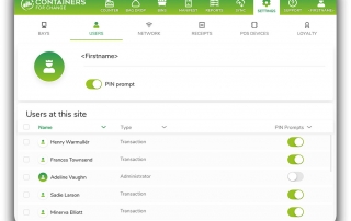
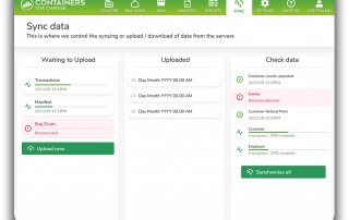
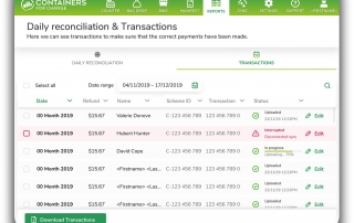
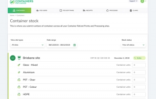
As a national recycling scheme is implemented state by state, Service Design helped to improve systems for container refund points and their operations to become more usable and scalable.
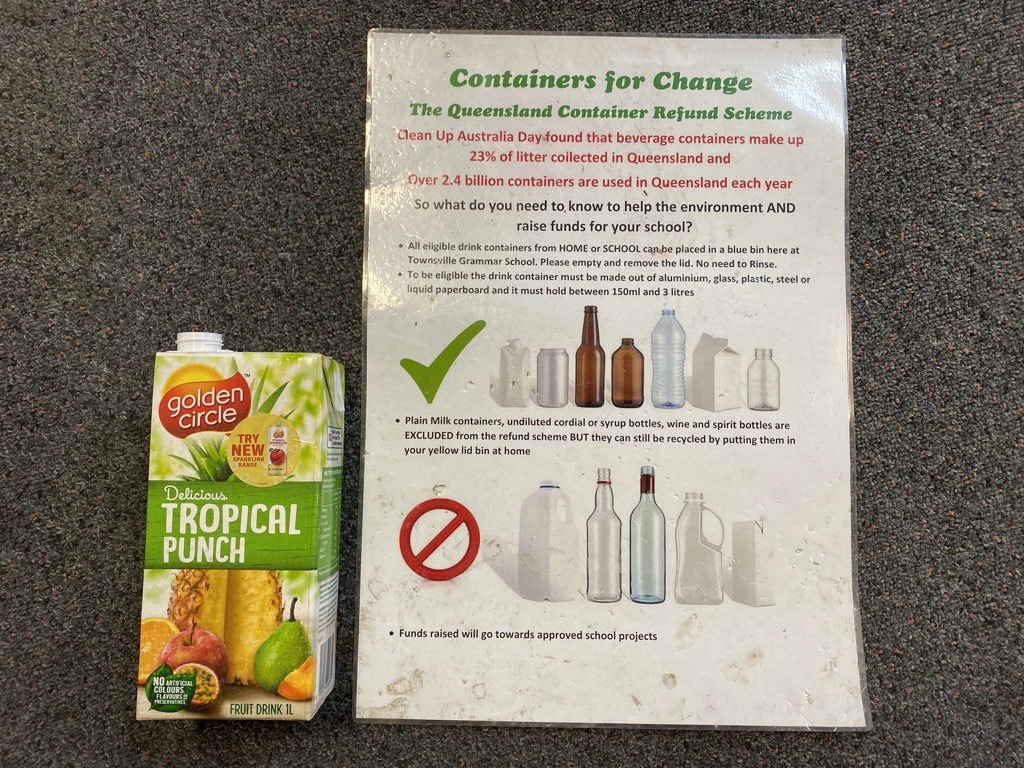
When Container Deposit Legislation was launched in Queensland, beverage manufacturers implemented the Containers for Change scheme through Coex (Container Exchange) a non-profit organisation.
CES (Container Exchange Services) is the environmental sustainability start-up jointly funding by Lion and Coca-Cola Amatil. Together, the partnership’s mission is to increase recycling, reduce litter and landfill, and create opportunities for community groups and social enterprises across Australia.
CES delivers and centralises the critical business systems and services for recycling services including; Information Technology, Financial Technology, Marketing, Sustainability, Recycling, Logistics, Customer Service, Operations, and Materials Trading (Auction Platform). All of these services need implementation and optimisation through Service Design.
The Challenge
As is common in many technologically-driven start-ups, the success of service delivery tends to focus primarily on the speed of delivery and how rapid software can be built.
This criteria for function is effective in the beginning to prove that a service is deliverable, but it also has some risks in sacrificing flexibility when the service needs to change.
Initially, the systems and workflows were erected, but the challenge was now in enabling services at scale as it rolled out of Queensland to other states in Australia.
This rapid deployment of technology meant, in this particular case, that delivery was prioritised over the usability and the impact this had on the utility of the operators and experience of customers at the recycling points.
Validation of utility was determined by UAT (User Acceptance Testing) and the number of containers that are being recycled as key success criteria. There did not seem to be any success criteria based on the customer or operator experience of the service.
Defining success
The first part of any strategic design exercise is to understand what an organisation’s aims are. Sometimes, there is a clear brief but often, there needs to be an internal discovery exercise to uncover individual stakeholders goals and why they matter to both them and the organisation as a whole. It is not uncommon to find that different stakeholders may have competing interests.
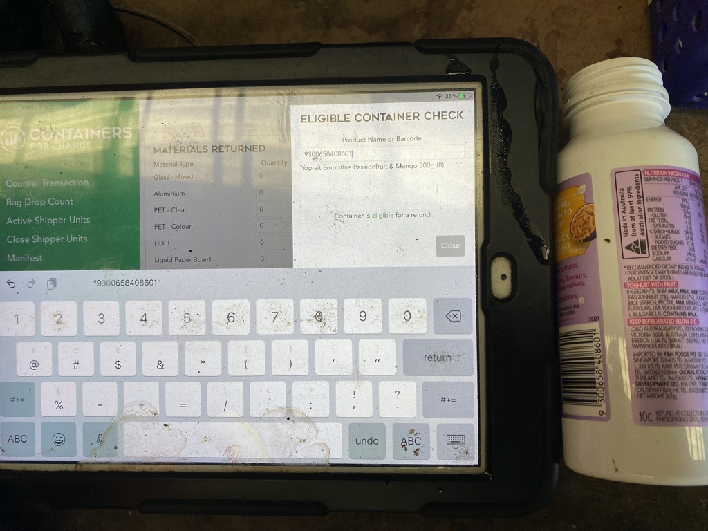
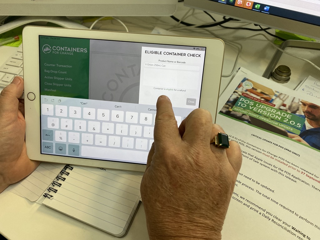
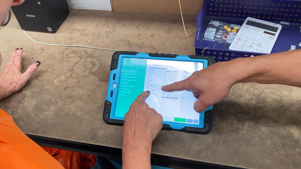
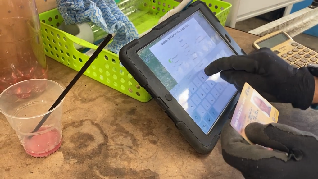
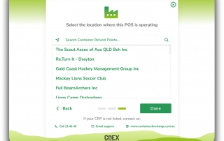
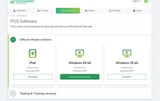
In this particular case, it seemed to be a very straightforward exercise of improving the front stage systems that recycling operators used to identify, count and recycle the containers that were coming in from citizens in different states. The systems were called POS (Point Of Sale) systems on iPads and the CRP (Container Refund Portal).
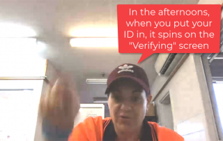
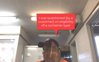
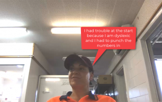
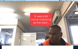
After speaking with individual stakeholders to determine what they would like to see as success criteria, I also spoke to some of their team members closer to the products about how they might like to see these systems develop.
User Experience and Usability were the key indicators to be enhanced. It was therefore crucial to set a baseline for the current states to measure if and how any improvements might be made in any future states.
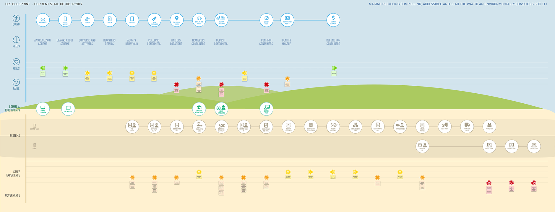
Service Design Blueprint – Current State
Service Design involves researching how a service, if existing, will meet the needs of the end user, customer, citizen. This service can expand across a variety of contexts and systems.
In this case, it started in the broadcast media, where people visited a website, downloaded an app and then interfaced with a staff member using a POS iPad.
This is called the “Front stage” of services as it’s where the interactions take place with the public. The service continued in the back-office administration or “Back stage” to ensure that the service continued to meet the needs of the public and the supplier organisations. In this case it was the CRPOs.
In order to understand the service from beginning to end, it is useful to map the customers and operators perspective of where they are involved with different people, systems, procedures and policies.
This is where a current-state service blueprint comes in handy. It illustrates a story of the customer journey before, during and after their experience with the service.
It allows for where they come into contact with the ‘front stage’ touch-points as well as the ‘back-stage’ processes, systems and workflows supporting the services at different points in time.
Primary Research
In a 3-month Human-Centred Design engagement, a discovery approach was outlined to identify the problems that the Container Refund Point Operators (CRPOs) were experiencing. I would need to undertake Primary Qualitative Research as no research had been done previously.
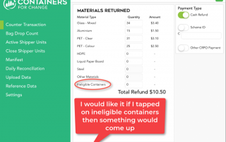
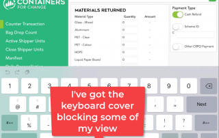
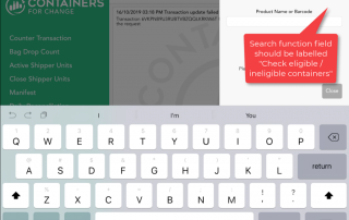
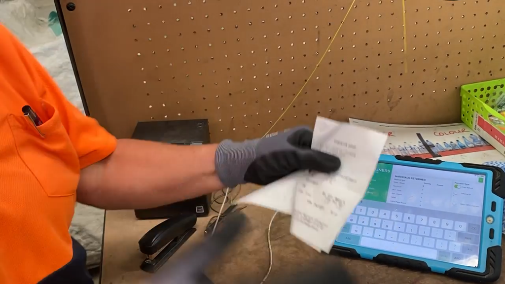
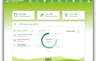
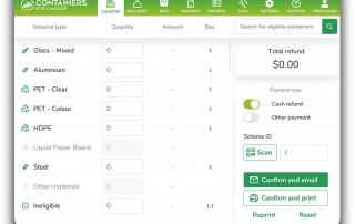
POS iPad
Usability Testing the current state internally
Whilst the requests for research budget and protocol were being established, it’s sometimes useful to conduct a usability test with any products to get a better idea of the experience and functionality of the services.
I recruited 4 people with minimal or no training with the systems and asked to perform a few tasks on the 2 systems.
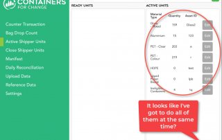
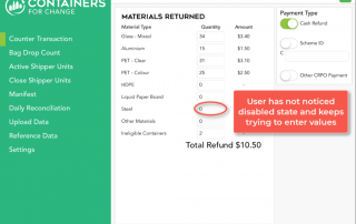
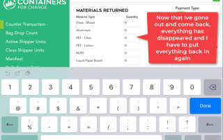
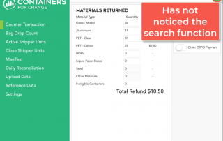
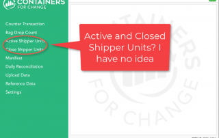
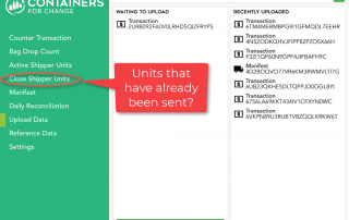
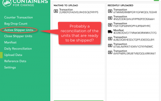
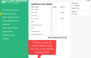
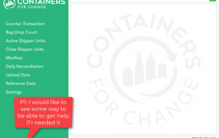
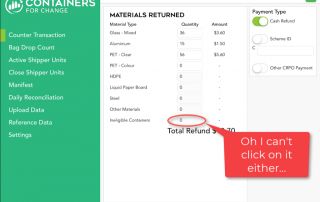
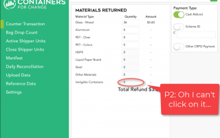
The POS iPad is a system that is used by front-stage workers as they interface with customers who are bringing in containers to be recycled. I asked 4 participants to perform the following tasks without training materials:
Here are the results of the POS iPad in its current state. Task completion doesn’t look too bad at 76% (78% is average). Ease of use was below an acceptable average of 68%.
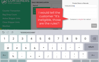
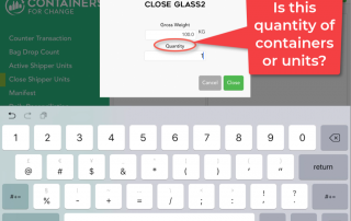
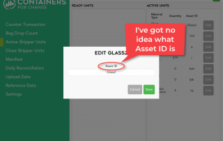
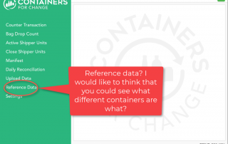
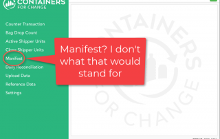
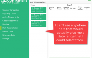
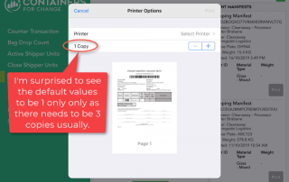
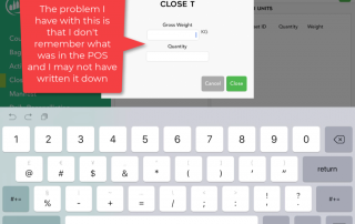
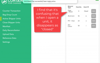
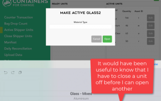
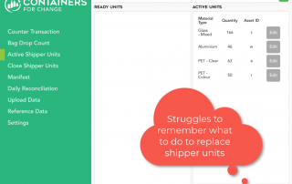
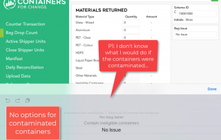
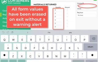
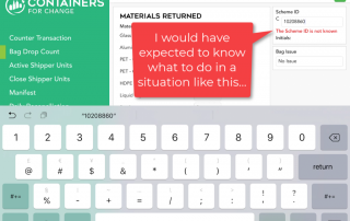
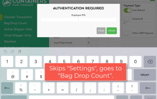
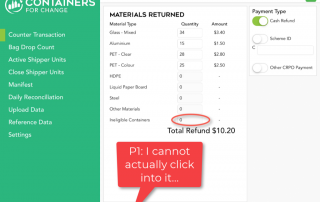
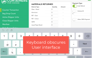
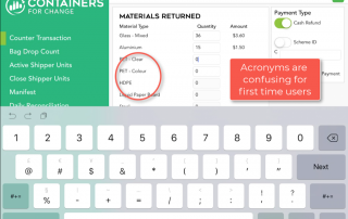
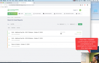
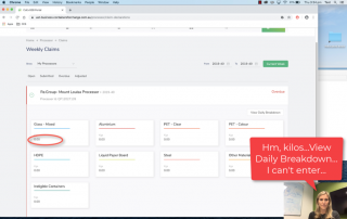
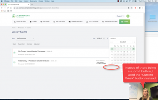
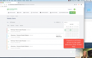
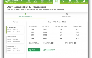
The results, although low in sample, indicated that although some functions were relatively easy, others were not. What was apparent in observation is that while the participants had some familiarity of the terms of the tasks (eg. “Manifest”, “Daily reconciliation” etc) because they worked there, even they struggled to find the controls or were confused by the function expectations and interface elements in order to try to complete each task.
Participant 5
“Not intuitive, poor navigation and explanations, nowhere to go for help, clunky and unnecessarily complicated”
Contextual enquiry
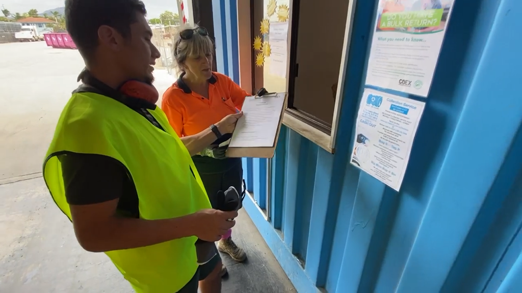
In order to verify the internal findings, I decided to take an excursion to the far northern reaches of Queensland to Townsville where I could conduct some contextual enquiry studies.
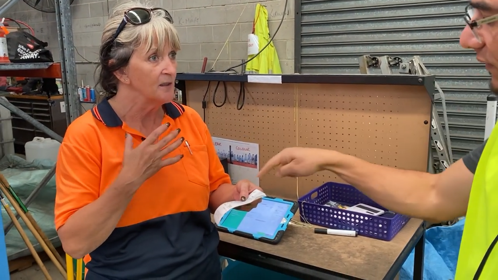
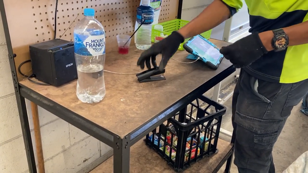
The aim of this type of research was to gain an understanding of the user types, the contexts of their workplaces, their cognitive states when they were using Point Of Sale devices in iPads with customers as well as any administrative problems regarding the Container Refund Point portal.
Observational shadowing
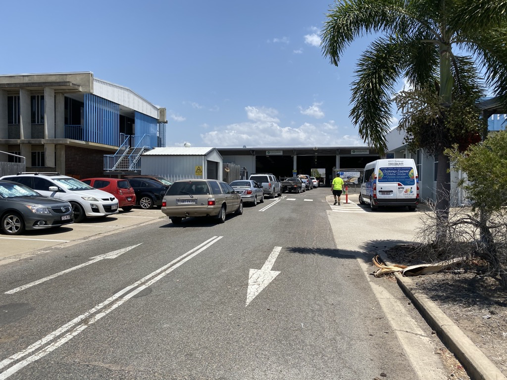
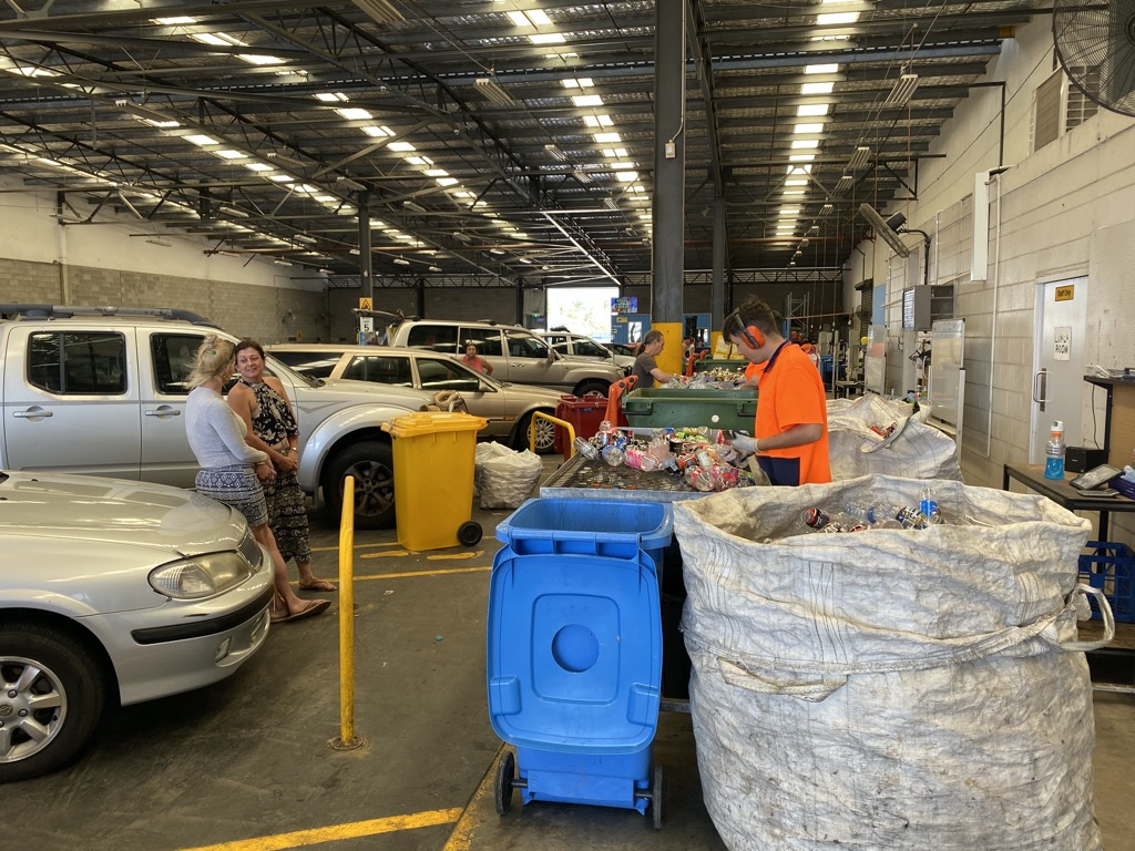
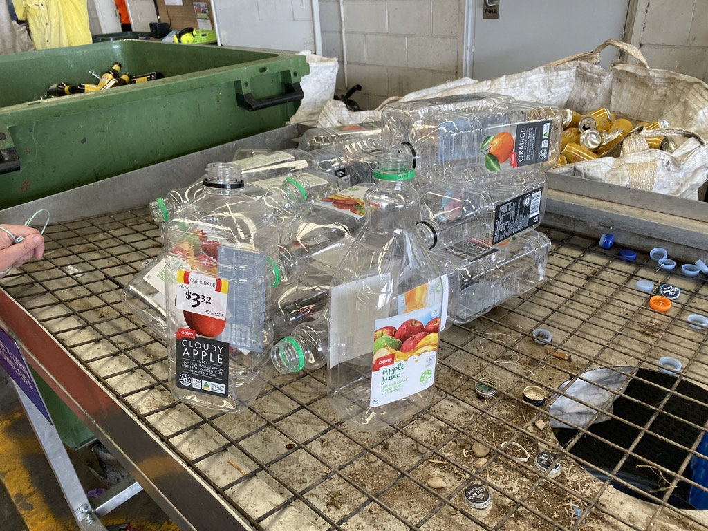
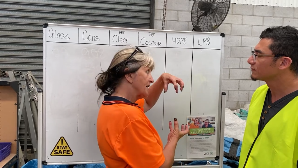
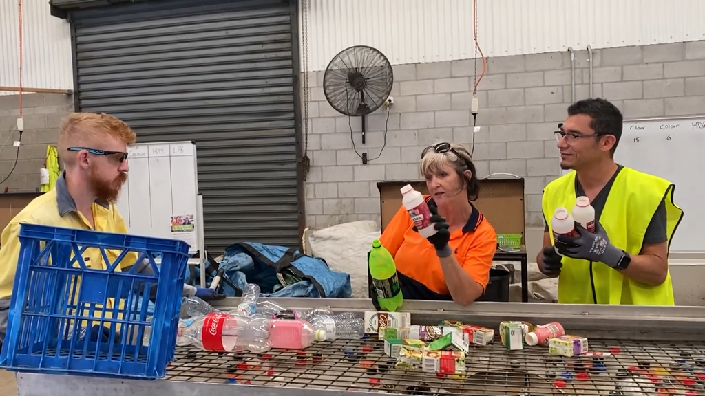
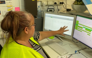
The first place to start contextual enquiries was at the touch-point of where the customers encountered the service. This was to get an understanding of the customer journey from the point they arrived at the container recycling collection point. It was immediately apparent to observe the contexts of the customer waiting in their vehicles to pull into a recycling plant and be directed to the counting stations.
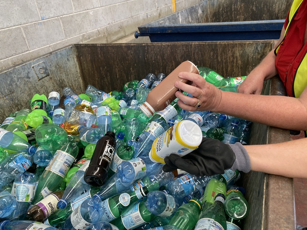
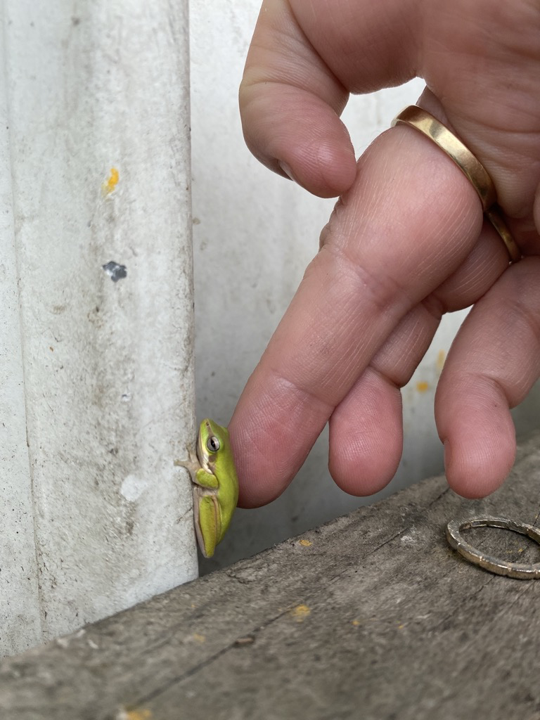
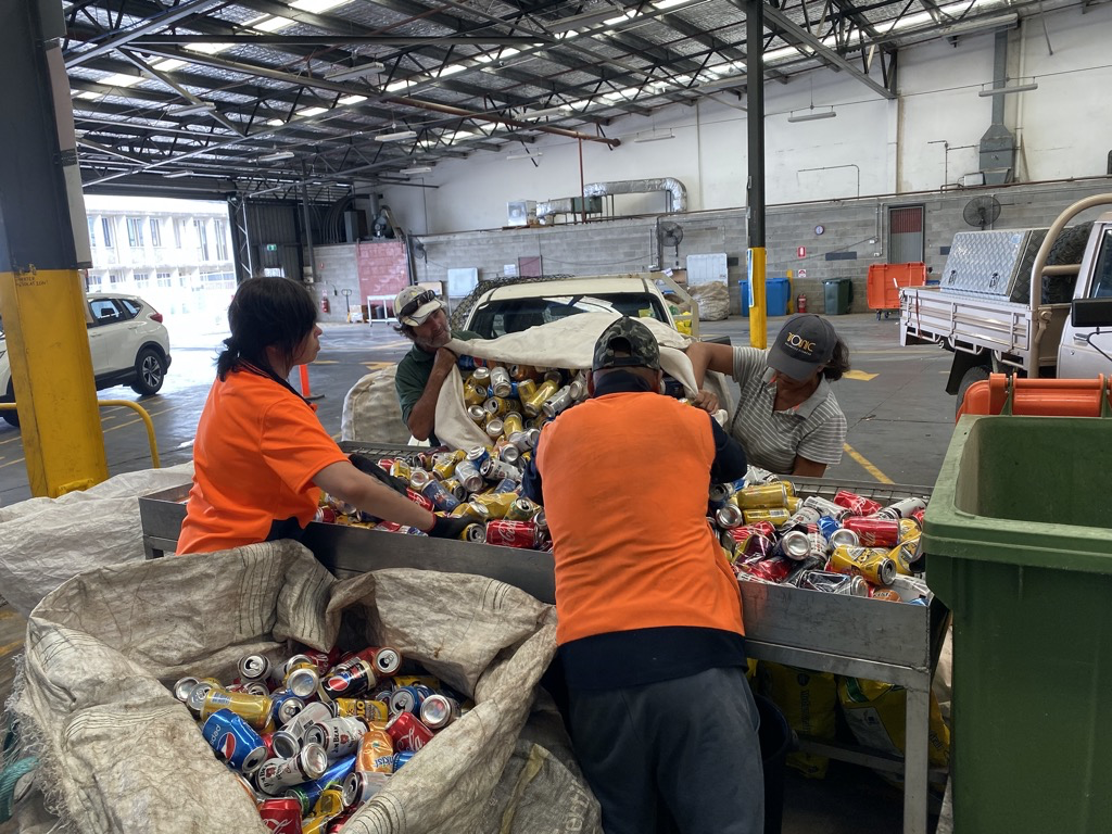
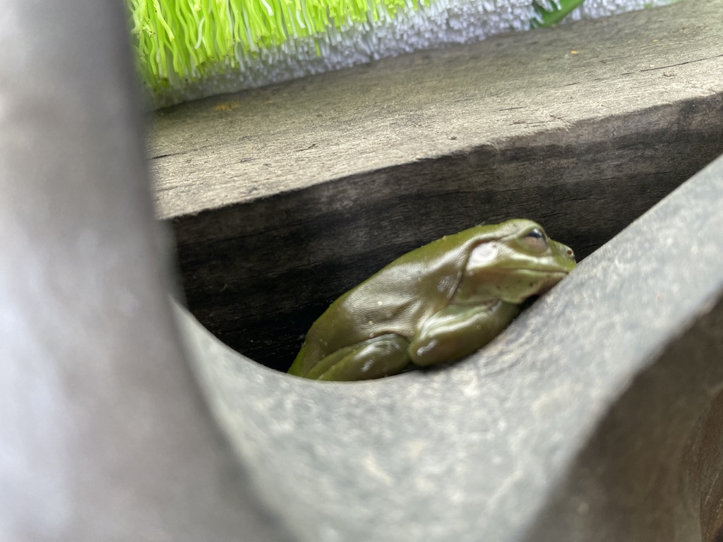
Here, they would unload their containers from the vehicles to a counting/sorting table manned by an employee who identified, sorted and counted the different types of containers. Sometimes, critters like Green Tree Frogs and snakes were found living in the containers (Yikes!).
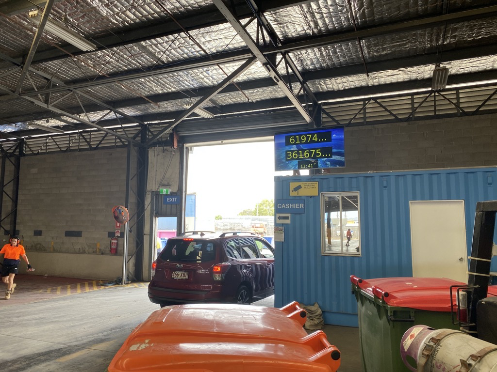
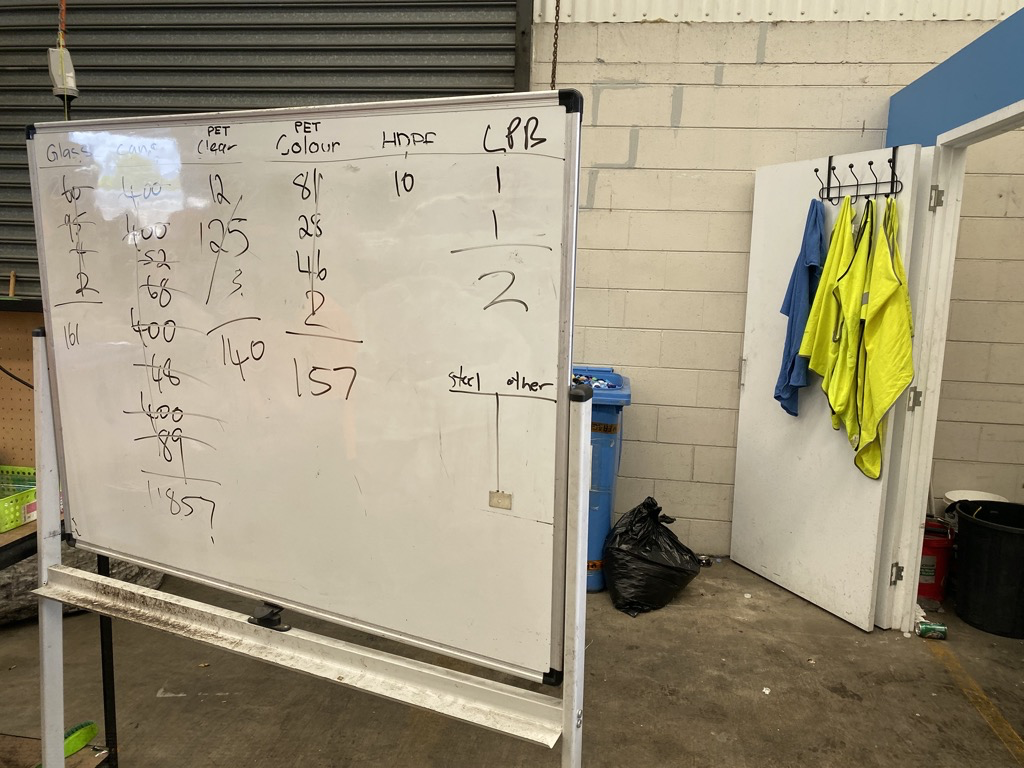
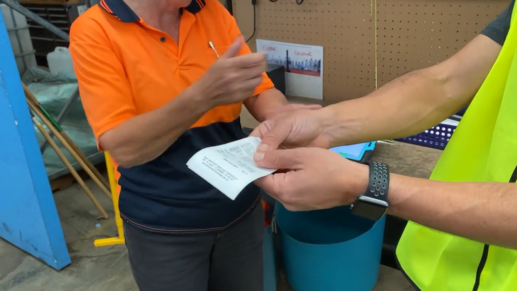
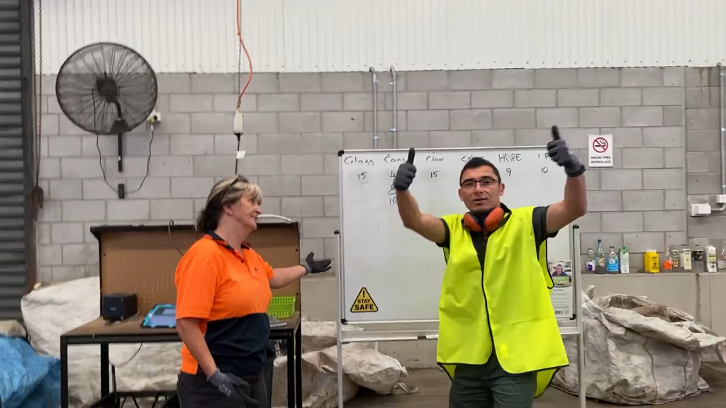
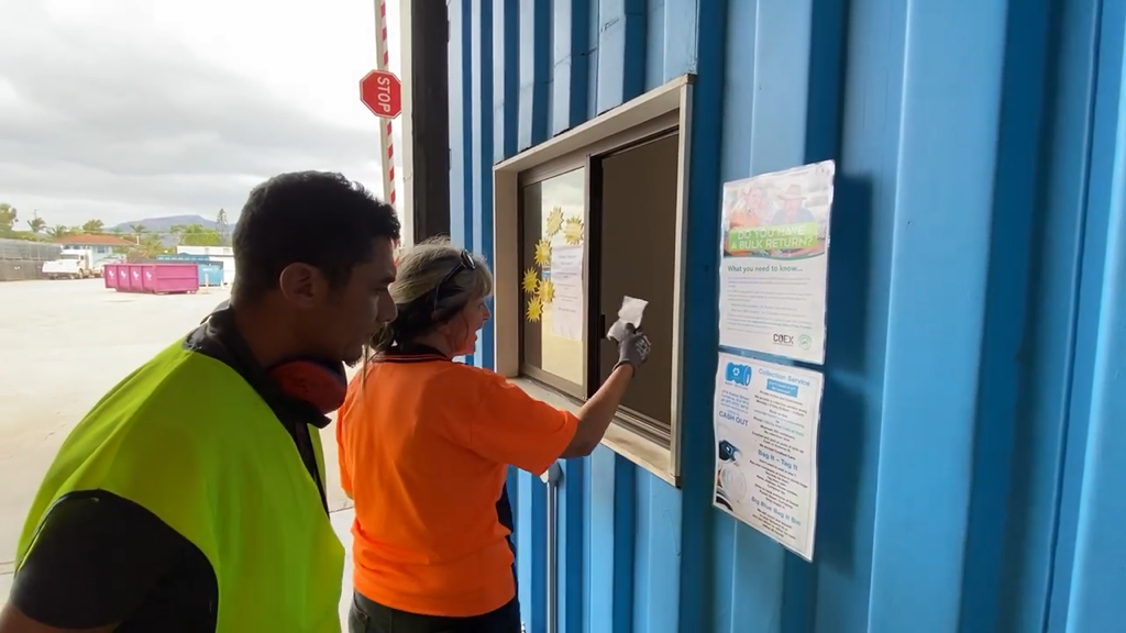
Once the counting was completed, the attendant would confirm the units and the refund amount on a whiteboard in front of the customer. If agreed, the customer would then receive a receipt which they would then drive to the cashier to receive their refund either as cash or as a bank transfer.
The scope, in this project, was mostly to improve the internal systems being used by the operators. The customer experience was part of another project but it was still useful to determine where the service directly or indirectly impacted the customer experience through the operators’ usability of the systems.
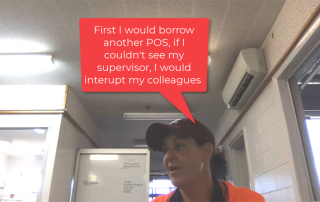
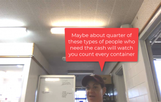
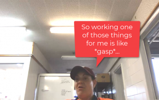
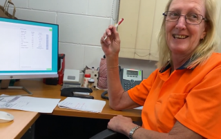
In order to understand the context of the workers, I requested if they could train me as a “first-timer” so I could get a better idea of how the service was situated in terms of procedures, tools and environments. This also allowed me to build a rapport with the other workers which helped me to approach them, ask questions and build an empathetic understanding from their perspectives.
CRP Portal
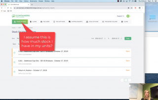
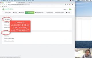
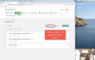
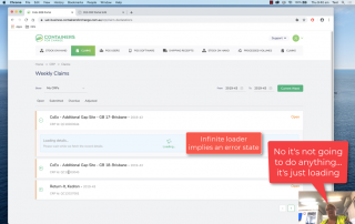
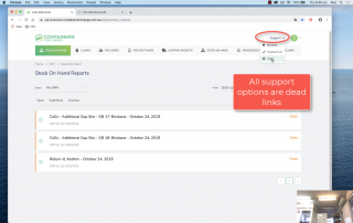
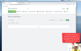
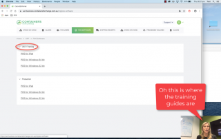
Usability Testing the current state with operators
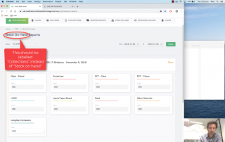
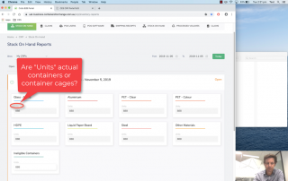
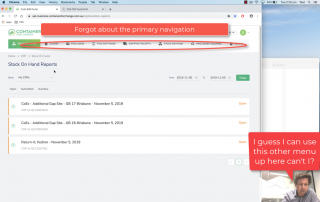
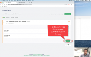
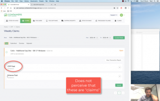
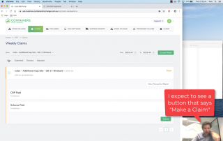
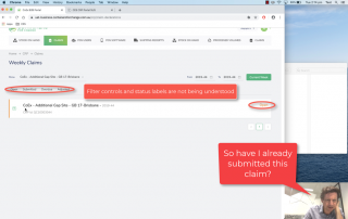
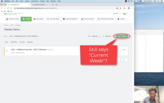
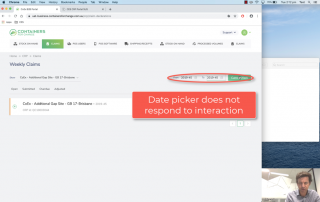
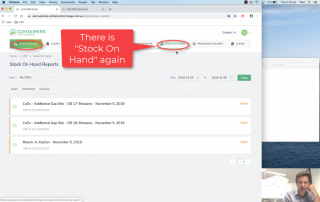
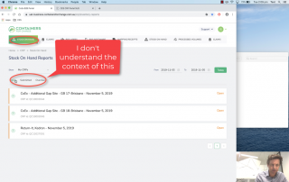
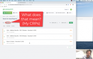
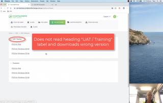
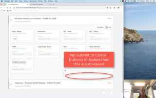
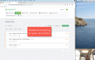
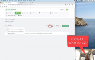
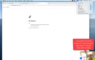
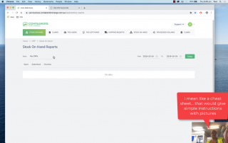
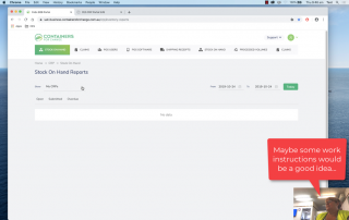
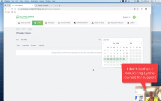
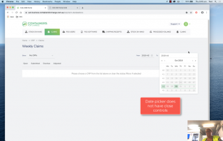
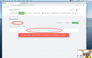
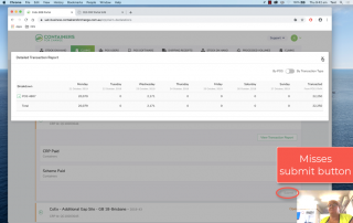
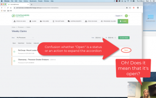
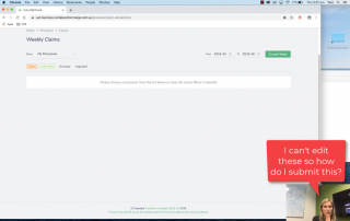
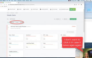
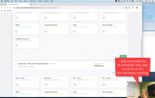
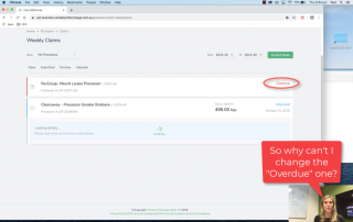
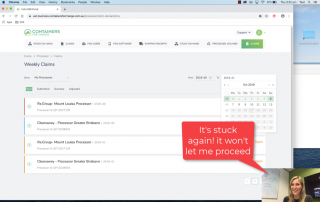
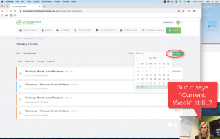
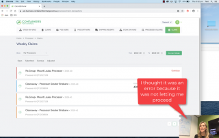
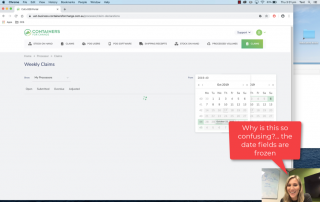
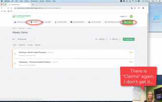
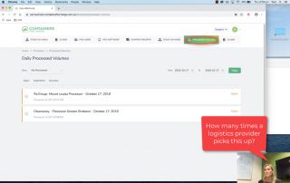
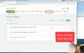
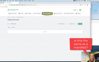
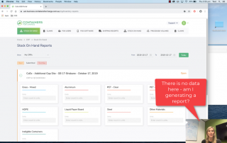
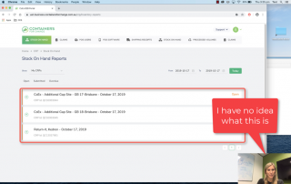
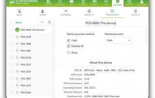
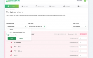
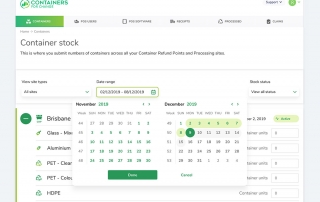
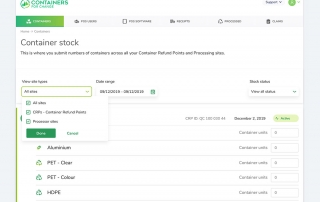
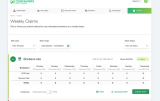
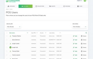
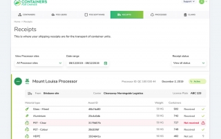
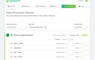
The CRP Portal is a system used by the owners or operators of a recycling plant that is used by administrators to manage the POS devices, users as well as other administrative functions. I also asked these same 4 participants to perform the following tasks without training materials:
- Submit a claim
- Check claims
- Update stock
- Update POS device
- Add an employee (user)
Task completion in its current state 53% was well below the 78% average. Ease of use was also way below the average (68%).
Participant 1
“I found the system very confusing to navigate. I was under-confident in inputting the data. It seems like a very simple process, but this tool feels unnecessarily complicated.“
Redesigning the Service
Now that we had some baselines for improvement and undertook some research to identify where to start, we could start to deconstruct and reconstruct the UI (User Interface) to deliver the needs of the user in the easiest way possible.
